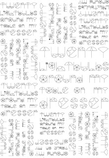
My original rationale was- An image driven investigation
into branding and identity with a focus on print retail. After finishing the
module my rationale has now changed to- A type and image based investigation
into packaging with a focus on print and retail. I found this changed a lot as originally I
wanted to focus on image more but found myself creating typefaces based on the
themes of the briefs and combining image into the font. I also found that I did
not really focus on branding and identity apart from applying the typeface as
the brand. The typefaces I created did
include image in them and ended up being quite decorative which is what I
intended in the start as I wanted the typeface to be used in shop windows and
generally on large-scale design.
I wanted to use foiling for two different briefs but to give
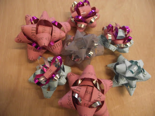
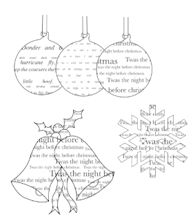
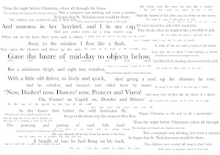
different effects on each one. For the Christmas brief I wanted to use foiling
or foil blocking to give a ‘Christmassy’ look using silver and gold foils on a
range on different colourful stocks. For my H Samuel brief I used foiling, as I
wanted my packaging to look expensive and luxurious. I did this by foiling
silver foil onto black paper. The theme of my H Samuel brief was to do with
fame and the image used was the walk of fame stars in the sidewalks in
Hollywood. I have difficulties with
printing the image on the black card I originally brought, as I couldn’t screen
print the star, as it was too detailed. My first attempt was printing the black
onto white card with the star, which didn’t look nice at all. I tried printing
onto the black card in digital print but the stock could not be detected. I
then resorted to printing onto black paper on the laser printers and foiling
onto that and using the laminator, then I printed the star image onto stickers
and stuck that onto the black card. This actually worked really well and when
photographed professionally they looked really good. With the Christmas brief I
had digitally printed the design as the stock used was too thick for the laser
printers. I therefore had to foil onto it by exposing a screen and screen-printing
the design onto the stock using a glue type liquid and then using the heat
press to foil onto it. I found this didn’t work as well as I had hoped and
preferred the laminator process. A lot of my briefs were focussed on designing
for retail, which I didn’t necessarily do on purpose. Some briefs I enjoyed
designing for retail more than others but overall my favourite brief was the
Christmas one.
Time management for this module was really good towards the end but at the start I found it hard to get ideas
going. I also felt I probably spent too much time on some briefs more than
others for example I spent less time on the M&S Picnic brief than I hoped to and feel I could have done a
lot more work.


